click image for slideshow
When our client purchased this house she knew the bathrooms weren’t up to her needs or style. In the master bath an oversized Jacuzzi tub but minuscule pedestal sink meant there was no countertop space or storage. Her daughter’s bathroom was tiny with two doors opening into it and the powder room was strangely bare with lots of wasted space.
The house was built in the early 1900’s and we aimed to keep a nod to that era while designing updated and fresh looks for each bathroom. The master bath was rearranged to allow for a long vanity in soft gray custom designed with lots of storage for necessities and towels, as well as a pull out for hairdryer, and built in jewelry boxes. A contemporary free standing bathtub provides ample bathing area in a streamlined shape. Keeping everything light and airy, the softly antiqued finish on the wainscoting marble is paired with a polished white marble mosaic above to give a little shimmer to the upper walls. A patterned mosaic floor and shower wall add an enlivening element in an otherwise quiet space.
In the powder room we went bold with an unexpected floor to ceiling photo mural wallpaper of the Brooklyn bridge paired with an antiqued brass and crystal pendant fixture and marble hex flower pattern on the floor.
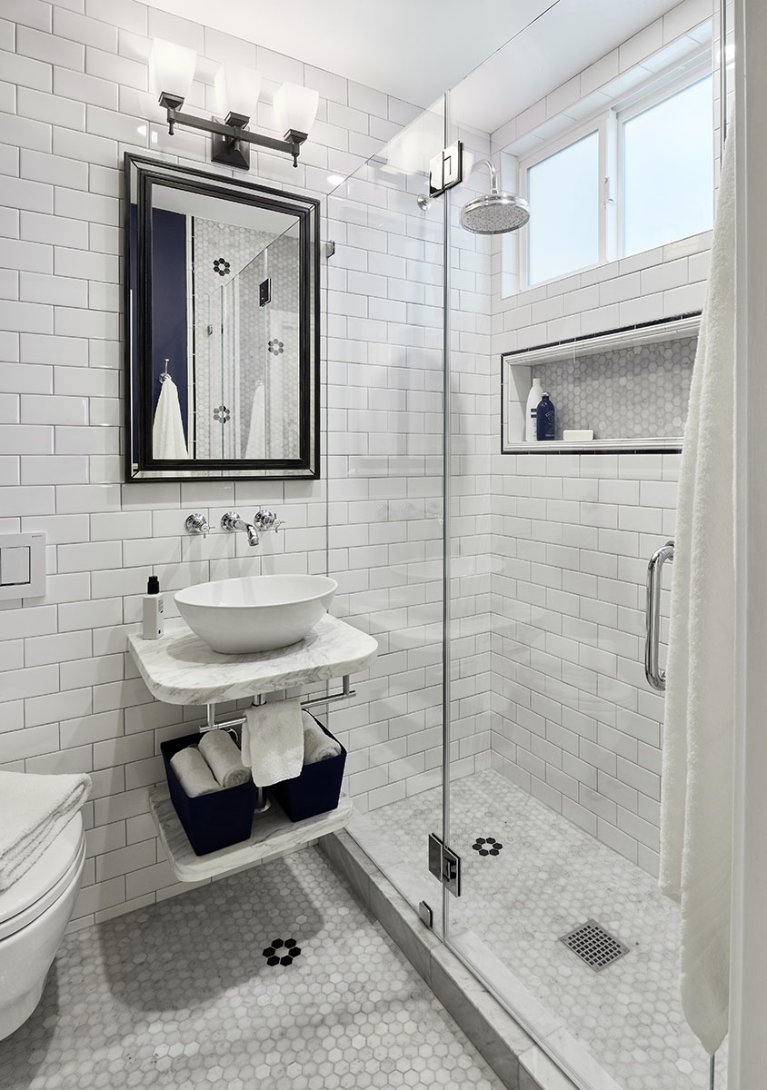
While we couldn’t enlarge the daughter’s small bathroom we maximized the tiny space with a wall mounted toilet and vanity counter and replaced an intrusive swing door with a pocket door. The same hex flower pattern from the powder room finds it way into this bath floor and a wall. The period appropriate white subway tile is offset with black details and dark navy walls.
All three bathrooms feel related and appropriate to the house while having distinct personalities and unexpected touches.


